Marble and lighting: seeing white tones correctly
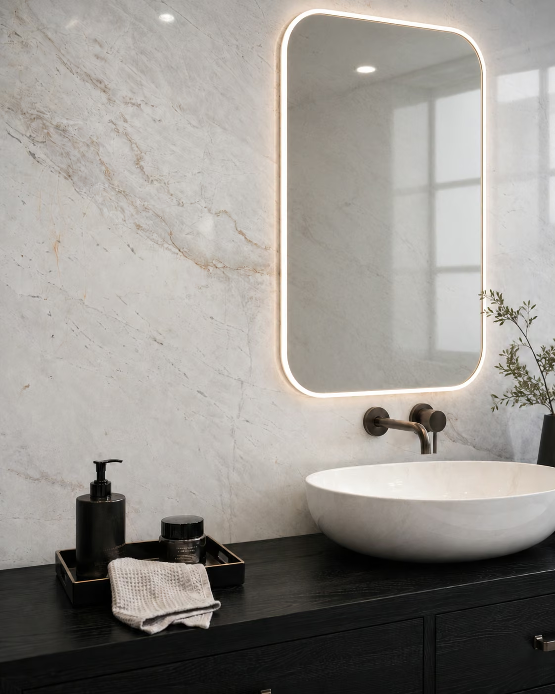
Marble's colour and veining are perceived under the light it is in. The same stone can look different by day, in warm evening light and on different screens. So colour approval should not be given from a photograph alone; the sample should be assessed under the real or similar lighting and together with the neighbouring materials.
See the stone with its surroundings, not on its own
Examining a white sample on a white table and next to dark timber does not give the same visual experience. Bring together samples of the cabinet doors, wall paint, metal and textiles. Do not explain marble looking warm or cool by the name of the stone alone. The surrounding colours can affect perception too. Note in your decision file which adjacent materials the approval was given with.
Check twice: by day and in the evening
If the space will be used throughout the day, assess how it looks at different times. Light from a window and artificial light alone may not give the same result. If possible, view the sample in a position close to the orientation and height at which it will be used. A stone chosen on a horizontal table can read differently on a vertical wall.

Look at a fitting's real effect rather than its name
In choosing lighting, a single colour temperature value does not describe the whole look. The direction of the light, its distribution, its reflections and how it renders colours matter too. If the stone choice is sensitive, set up a small sample arrangement with the real fitting. Assess it from the angle from which the surface will be seen most. This can be more revealing than comparing catalogue images alone.
Consider gloss and the angle of light together
On glossy surfaces, windows and light sources can join the composition as reflections. A light close to the surface can make the stone's texture and the look of the installation more pronounced. That does not mean the same look will appear on every surface. Where necessary, use a trial panel to confirm on a large surface the effect you liked in the sample.
Record the limits of deciding from photographs
Phones can change the white balance automatically, and editing after the shot can affect colour too. Use photographs for exchanging ideas, not as the only basis for accepting a sensitive colour. If a physical sample is sent to a distant project, its reference code and lot information should be in the file. Every team should know it is talking about the same sample.
When assessing material with Mabella, share the lighting approach and the adjacent materials of the space. Instead of looking for a “whiter” stone, describing how you want it to look under which light and alongside which colours makes the proposals more meaningful.
Frequently asked questions
Why can the colour in a phone photograph look different?
Automatic white balance, screen settings and the light the photograph was taken in can change how colour is perceived.
Is it enough to see a sample in daylight?
In a space that is also used in the evening, it helps to assess the look under artificial light separately.